Post by Hill on Apr 20, 2015 15:36:44 GMT
Common questions we see the Google Earth Community Forums are:
1) Why is my area still blurry?
2) When is the next update?
3) Why is the imagery so old?
4) Why did my placemark move?
5) Why does this area look so funny?
Before I answer those questions, understand that as a moderator, I am not an employee of Google, and my conclusions are based upon my experience viewing the globe via Google Earth (and more recently Google's ocean, Google Mars, and Google Sky). I can't know the full reason why one area is updated and another isn't, or when it will get newer or better imagery. I can only make educated guesses.
I'll try to give understandable answers here, but each place is unique and may need more than one answer to come to a conclusion.
Quote:
1) Why is my area still blurry?
First it is worth noting that the land surface area of Earth is about 150,000,000 sq km (57,500,000 sq mi). Google has been adding and improving quality of imagery since late 2002 when the globe we know of today as Google Earth first appeared as the Keyhole EarthViewer.
Quote:
2) When is the next update?
As fast as imagery is updated, Google Earth will never be anywhere near real time. (Well, I can't really speak for what will become possible in 10,20,or 50 years).
Generally speaking, more populated areas get updated more frequently, but the imagery of low and non-populated areas is far better that it was 10 years ago, and some natural areas are depicted very clearly.
3)
Quote:
Why is the imagery so old?
Aside from what I mentioned as an answer to 1)and 2) above, there are other reasons. Take a look at the following series of images centered on Barksdale Air Force Base near Shreveport, Louisiana. If you want explore the imagery for yourself type (or copy and paste) 32 30.771 N, 93 40.812 W into the "Search" box. While it is true that most of GE's imagery is captured by satellites owned by such companies as DigitalGlobe , Spot Image , and more recently GeoEye , a good percentage is aerial photography taken by planes flying a various altitudes. We will be concentrating our examination on the area of the tiny blue rectangle in the center of this view.

NOTE: While the default imagery was aerial photography when I first created this post, it is now, in April of 2015, satellite photography.
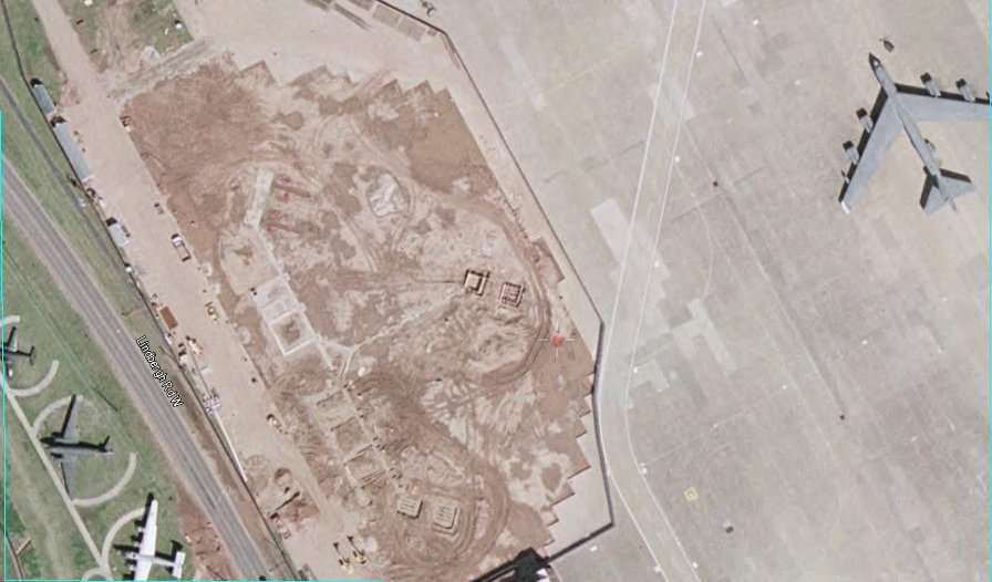
March 22, 2002, USGS aerial imagery. Although older, it is sharper than much of more recent imagery.
For many years this was the default GE imagery. Keep your eye on the dark green plane at the lower left.
It is a C-47 that is part of the base's air museum. Other things will change with time but it is in a fixed
position. That's a B-52 at upper right and a construction area showing bare earth in the middle.
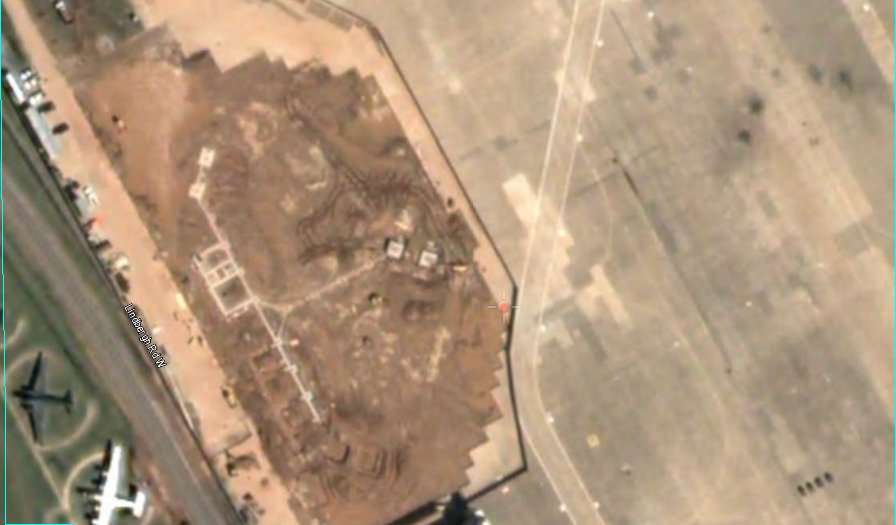
April 30, 2002. DigitalGlobe (DG) satellite imagery. The construction has changed little and the B-52 is
gone. The view is newer but blurrier.
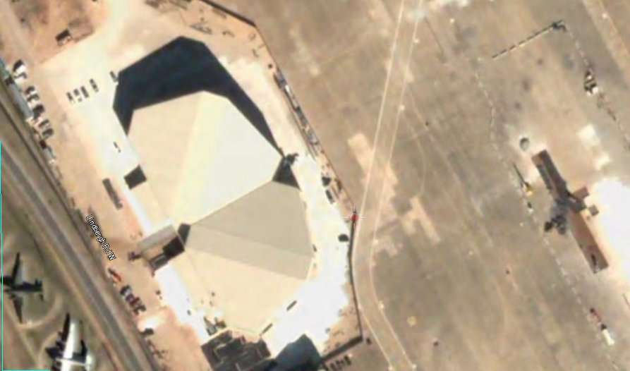
February 16, 2003. The imagery is still not as sharp as the March 30, 2002 imagery. The construction,
new hangars, is finished. Something is taking shape on the runway. Notice the thin blue/green line at
the left edge of the image. It is part of an overlay and is fixed in latitude and longitude.
Quote:
4) Why did my placemark move?
Look at the C-47.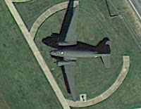 Its nose is now touching the line. There is some image drift
as new imagery is stitched onto the globe.
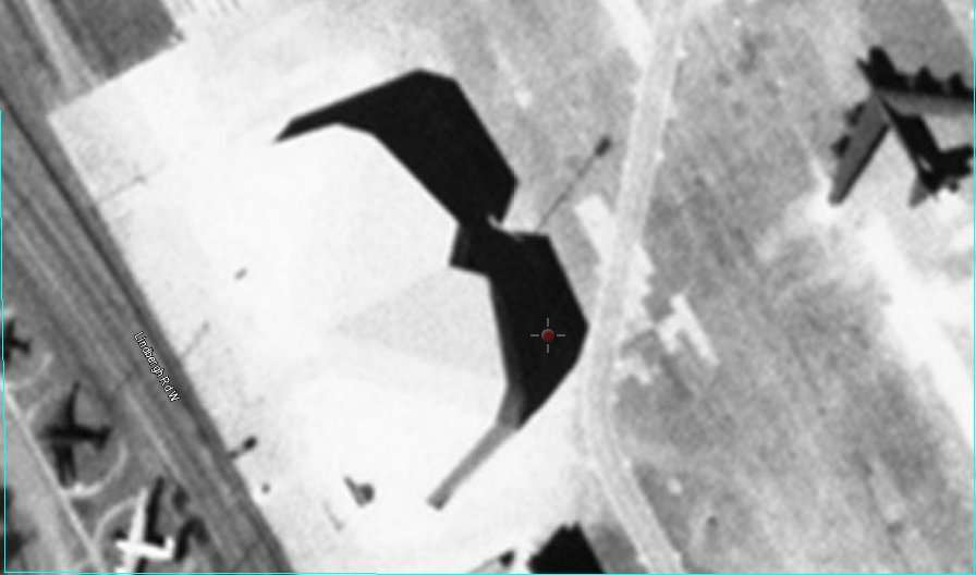
February 15, 2004. The B-52 is back and whatever was happening on the runway has disappeared.
Much less sharp and no color! This USGS imagery is obviously not a good replacement.
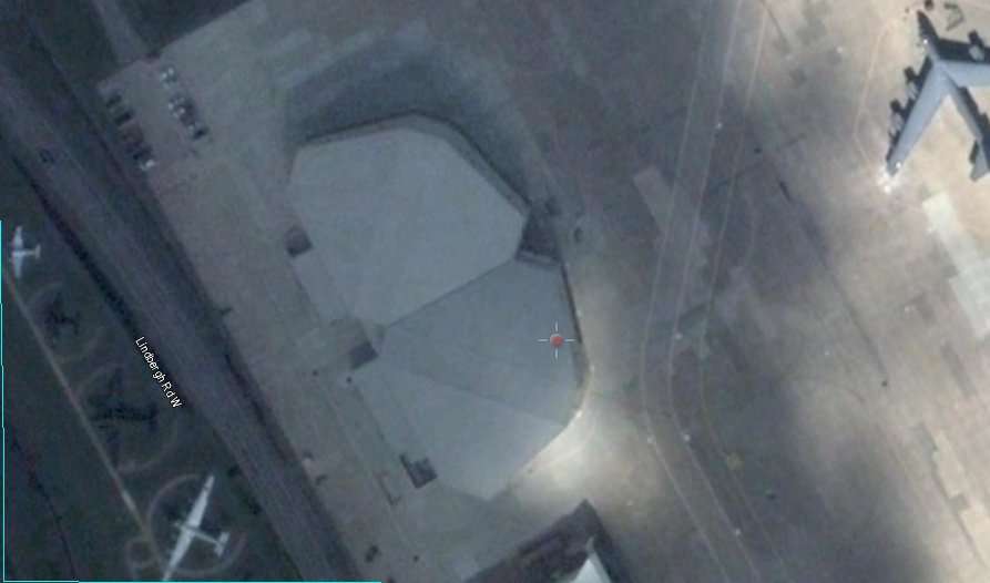
October 26, 2006. Not as sharp and there is a cloud shadow darkening the view and a cloud is
obstructing the view of a nearby area. Notice that the C-47 has now moved eastward in the past two views.
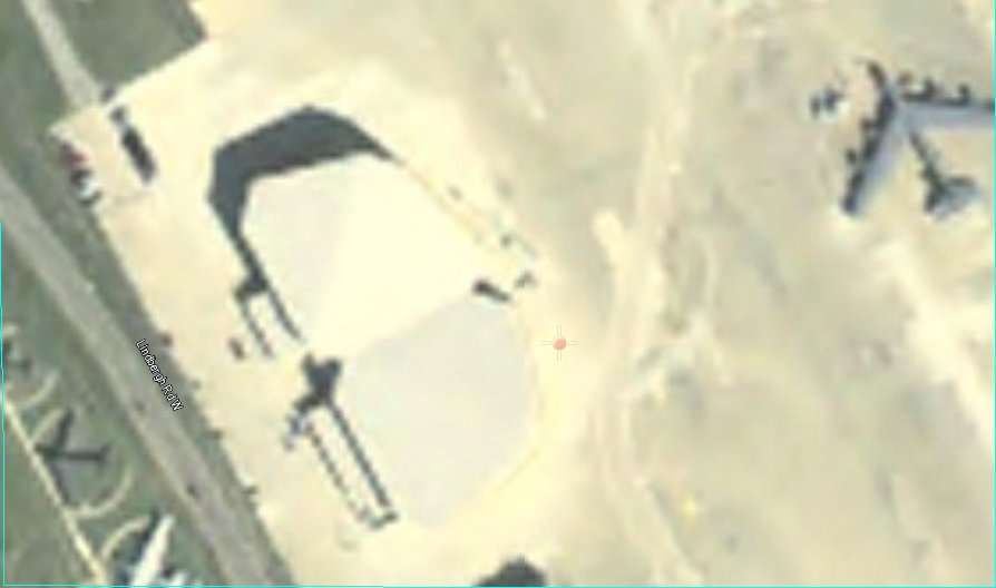
June 25, 2006. Not good at all. Depending on where you look, the time slider or the date at the lower
left, the dates are more than four months out of sync.
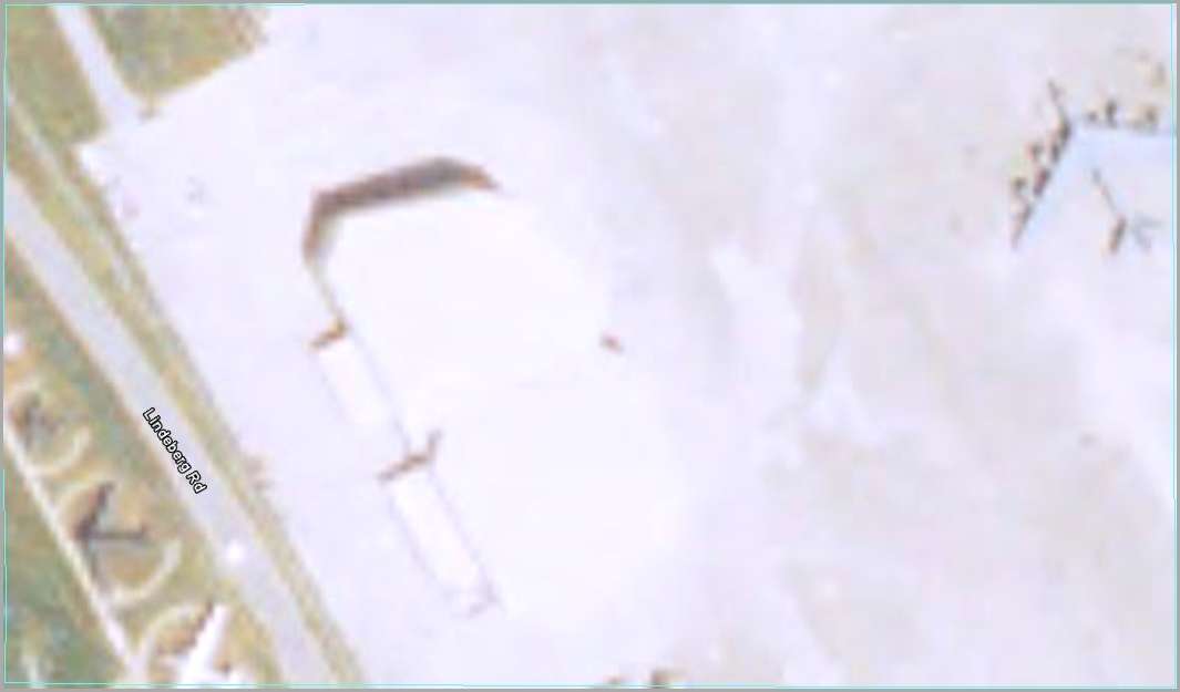
July 22, 2007, (or time slider date 10/27). There was still no available imagery better than the 2002 imagery.

November 3, 2010. This was the replacement Google Earth default image and, except for the severe
overexposure of the newer hangars, it is sharp and clear. One other thing to take into account is that
the imagery is purchased based on the overall view and some things within that imagery may be less
than ideal, as is the case with the hangars.

January 31, 2013 (Default imagery as of 4/20/2015). Finally a better view.
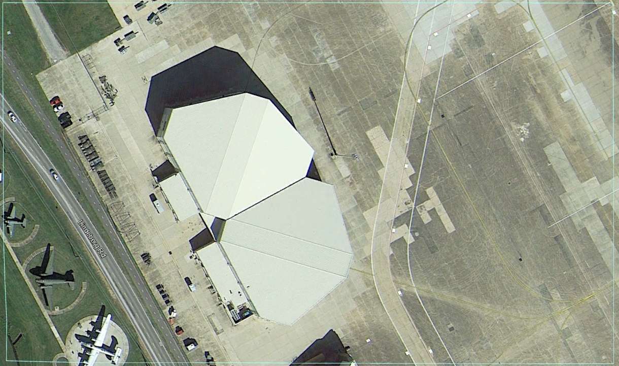
Historical imagery 10/29/2014 This newer imagery is available using Historical Imagery, but Google has chosen
not to update the default imagery. Sometimes Historical Imagery is newer that the default.
Several things determine which imagery is available for Google Earth. First it must be available for lease or purchase. The cloud cover is important. A few widely scattered clouds are OK it seems (but there is always some guy whose house is under that little cloud and he will complain that he used to be able to see his house, but now he can't.) The time slider should be helpful for those whose personal imagery has "regressed". The following set of DG images are thumbnails of available full size images.
( You can no longer access them at Layers > More though you can see the footprints of imagery taken from 2002 - 2010). Many satellite images look like the one below and are completely useless for GE's purposes.

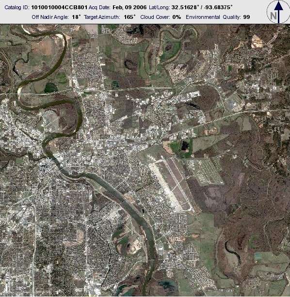
While this thumbnail image above seems perfectly clear and much
more current than the default Google Earth view, it is the one which
produced the very blurry image in the November 2006 closeup of
Barksdale AFB above.
Below, example of other imagery not used because of too many clouds.
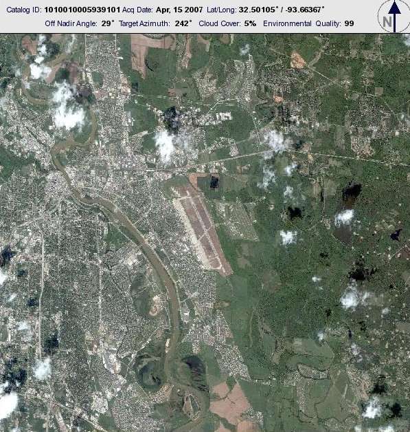
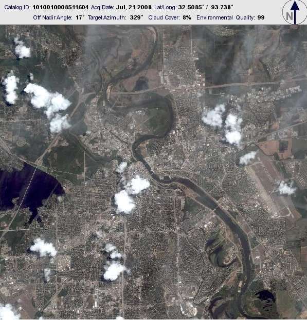
For best viewing the image also needs to be taken close to noon, when
shadows are shortest. Shadows are also shortest in summer, but if
there are a lot of deciduous trees, winter may allow a better view when
foliage is off the trees. Snow on the ground can help to reveal things
or make it harder to see details.
Quote:
5) Why does this area look so funny?
When imagery is purchased I'm sure that no one goes over the content except to evaluate to general quality. Various imagery errors, unless very obvious get included with the 99.99% of the useful imagery. If you want to see what these errors look like, go to THIS POST in oGEC. While some links are broken, it will help you to figure out some of those imagery errors.
What makes Google Earth so fascinating for a "map geek" is that we get to discover the really interesting stuff. If you don't have good imagery of your house, or it doesn't show even though it has been there for 3 years, take time to explore the rest of the world, the oceans, Mars, our Moon, and the universe. It's a very good free education.
Comments below added by j_anonymous 6/17/09
Here's another question to add to your list.
Quote:
Q. What time was the photo taken?
A. If it was a satellite image, probably about 10:30 am.
Recent photos from Digital Globe are taken with the World View 1 satellite. This was launched on September 18, 2007. It is in a sun synchronous orbit with a 10:30 am descending node. ( the datasheet).
Digital Globe was using the Quick Bird ( data sheet ) from late 2001. This had a sun-synchronous inclination. I'm not enough of an orbital expert to tell you what that means, but the images appear to be taken about the same time.
World View 2 is scheduled to launch this fall. It is similar to World View 1, but has 8 multispectral bands (colors, these are useful for analyzing crops, etc.) This will also be in a sun synchronous orbit going overhead about 10:30 am.
A major difference between QuickBird and the World View satellites is the slew time. The satellite can only image a strip about 16 km wide, but the controllers have some freedom of which direction to point. (They don't always point straight down, they can point up to 30 degrees in either direction.) To move from one target to another the satellites "slew" or turn. Quickbird had a slew time of 62 seconds (to move 30 degrees). The new WorldView satellites have a slew time of 9 seconds.
A complete orbit takes about 100 minutes, and half of that is going to be in the dark.
1) Why is my area still blurry?
2) When is the next update?
3) Why is the imagery so old?
4) Why did my placemark move?
5) Why does this area look so funny?
Before I answer those questions, understand that as a moderator, I am not an employee of Google, and my conclusions are based upon my experience viewing the globe via Google Earth (and more recently Google's ocean, Google Mars, and Google Sky). I can't know the full reason why one area is updated and another isn't, or when it will get newer or better imagery. I can only make educated guesses.
I'll try to give understandable answers here, but each place is unique and may need more than one answer to come to a conclusion.
Quote:
1) Why is my area still blurry?
First it is worth noting that the land surface area of Earth is about 150,000,000 sq km (57,500,000 sq mi). Google has been adding and improving quality of imagery since late 2002 when the globe we know of today as Google Earth first appeared as the Keyhole EarthViewer.
Quote:
2) When is the next update?
As fast as imagery is updated, Google Earth will never be anywhere near real time. (Well, I can't really speak for what will become possible in 10,20,or 50 years).
Generally speaking, more populated areas get updated more frequently, but the imagery of low and non-populated areas is far better that it was 10 years ago, and some natural areas are depicted very clearly.
3)
Quote:
Why is the imagery so old?
Aside from what I mentioned as an answer to 1)and 2) above, there are other reasons. Take a look at the following series of images centered on Barksdale Air Force Base near Shreveport, Louisiana. If you want explore the imagery for yourself type (or copy and paste) 32 30.771 N, 93 40.812 W into the "Search" box. While it is true that most of GE's imagery is captured by satellites owned by such companies as DigitalGlobe , Spot Image , and more recently GeoEye , a good percentage is aerial photography taken by planes flying a various altitudes. We will be concentrating our examination on the area of the tiny blue rectangle in the center of this view.

NOTE: While the default imagery was aerial photography when I first created this post, it is now, in April of 2015, satellite photography.

March 22, 2002, USGS aerial imagery. Although older, it is sharper than much of more recent imagery.
For many years this was the default GE imagery. Keep your eye on the dark green plane at the lower left.
It is a C-47 that is part of the base's air museum. Other things will change with time but it is in a fixed
position. That's a B-52 at upper right and a construction area showing bare earth in the middle.

April 30, 2002. DigitalGlobe (DG) satellite imagery. The construction has changed little and the B-52 is
gone. The view is newer but blurrier.

February 16, 2003. The imagery is still not as sharp as the March 30, 2002 imagery. The construction,
new hangars, is finished. Something is taking shape on the runway. Notice the thin blue/green line at
the left edge of the image. It is part of an overlay and is fixed in latitude and longitude.
Quote:
4) Why did my placemark move?
Look at the C-47.
 Its nose is now touching the line. There is some image drift
 as new imagery is stitched onto the globe.

February 15, 2004. The B-52 is back and whatever was happening on the runway has disappeared.
Much less sharp and no color! This USGS imagery is obviously not a good replacement.

October 26, 2006. Not as sharp and there is a cloud shadow darkening the view and a cloud is
obstructing the view of a nearby area. Notice that the C-47 has now moved eastward in the past two views.

June 25, 2006. Not good at all. Depending on where you look, the time slider or the date at the lower
left, the dates are more than four months out of sync.

July 22, 2007, (or time slider date 10/27). There was still no available imagery better than the 2002 imagery.

November 3, 2010. This was the replacement Google Earth default image and, except for the severe
overexposure of the newer hangars, it is sharp and clear. One other thing to take into account is that
the imagery is purchased based on the overall view and some things within that imagery may be less
than ideal, as is the case with the hangars.

January 31, 2013 (Default imagery as of 4/20/2015). Finally a better view.

Historical imagery 10/29/2014 This newer imagery is available using Historical Imagery, but Google has chosen
not to update the default imagery. Sometimes Historical Imagery is newer that the default.
Several things determine which imagery is available for Google Earth. First it must be available for lease or purchase. The cloud cover is important. A few widely scattered clouds are OK it seems (but there is always some guy whose house is under that little cloud and he will complain that he used to be able to see his house, but now he can't.) The time slider should be helpful for those whose personal imagery has "regressed". The following set of DG images are thumbnails of available full size images.
( You can no longer access them at Layers > More though you can see the footprints of imagery taken from 2002 - 2010). Many satellite images look like the one below and are completely useless for GE's purposes.


While this thumbnail image above seems perfectly clear and much
more current than the default Google Earth view, it is the one which
produced the very blurry image in the November 2006 closeup of
Barksdale AFB above.
Below, example of other imagery not used because of too many clouds.


For best viewing the image also needs to be taken close to noon, when
shadows are shortest. Shadows are also shortest in summer, but if
there are a lot of deciduous trees, winter may allow a better view when
foliage is off the trees. Snow on the ground can help to reveal things
or make it harder to see details.
Quote:
5) Why does this area look so funny?
When imagery is purchased I'm sure that no one goes over the content except to evaluate to general quality. Various imagery errors, unless very obvious get included with the 99.99% of the useful imagery. If you want to see what these errors look like, go to THIS POST in oGEC. While some links are broken, it will help you to figure out some of those imagery errors.
What makes Google Earth so fascinating for a "map geek" is that we get to discover the really interesting stuff. If you don't have good imagery of your house, or it doesn't show even though it has been there for 3 years, take time to explore the rest of the world, the oceans, Mars, our Moon, and the universe. It's a very good free education.

Comments below added by j_anonymous 6/17/09
Here's another question to add to your list.
Quote:
Q. What time was the photo taken?
A. If it was a satellite image, probably about 10:30 am.
Recent photos from Digital Globe are taken with the World View 1 satellite. This was launched on September 18, 2007. It is in a sun synchronous orbit with a 10:30 am descending node. ( the datasheet).
Digital Globe was using the Quick Bird ( data sheet ) from late 2001. This had a sun-synchronous inclination. I'm not enough of an orbital expert to tell you what that means, but the images appear to be taken about the same time.
World View 2 is scheduled to launch this fall. It is similar to World View 1, but has 8 multispectral bands (colors, these are useful for analyzing crops, etc.) This will also be in a sun synchronous orbit going overhead about 10:30 am.
A major difference between QuickBird and the World View satellites is the slew time. The satellite can only image a strip about 16 km wide, but the controllers have some freedom of which direction to point. (They don't always point straight down, they can point up to 30 degrees in either direction.) To move from one target to another the satellites "slew" or turn. Quickbird had a slew time of 62 seconds (to move 30 degrees). The new WorldView satellites have a slew time of 9 seconds.
A complete orbit takes about 100 minutes, and half of that is going to be in the dark.
