Full Member
Cartographer
May 2015 - Oct 21, 2024 18:35:52 GMT
“ Fellow Royal Canadian Geographical Society „
|
Post by jeanthie on Jun 13, 2015 21:35:30 GMT
In 2006 I started the Google Earth Community Forum thread on "Global warming melts permafrost".(LINK) Most of the images and analysis covered permafrost in Wetlands in Canada in the sporadic and discontinuous permafrost zones which should be particularly sensitive to climate warming. The increasing availability of higher resolution images for the remote areas in Northern Canada provide a great new source of information which I would like to analyse and visualize.
80+ Years of Image Data
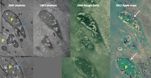
The figure below shows a time sequence of almost 65 years of a peat plateau just North of Lake Winnipeg in Manitoba. Peat Plateaus are islands of 'permanently frozen' peatlands in wetlands.
The 1947 air photo shows a dense cover of Black Spruce on the better drained plateau which is 2-3 feet higher then the surrounding fen wetlands. Black arrows show the direction of water drainage in the wetlands. This waterflow has over the centuries also shaped the teardrop appearance. The black lines outline the permafrost areas. The blue arrows show small collapse holes in the permafrost. The 1967 air photo shows relative small changes (light blue 1, 2, 3) compared with 1947, but these small islands have completely gone in 2011. The 2011 image is actually provided through the Apple Maps program which provides a unique very high resolution image which shows individual trees sinking into the ponds formed as result of melting of peatland ice.
Comparing 1967 and 2011 images, the outside edge of the permafrost of this peat plateau has receded by 40-65 meters. Most of it the last 20 years. Not much will be left of it in the next 10 years.
It is interesting to note that the peat plateau in the bottom of the images (not in the 1967 image) was burned (P + 5) probably around 1930. The forest fire did not cause any acceleration in the melting as can be seen in the 2011 image.
65 years of permafrost melting: the first 20 years 1947 to 1967 ,is from black and white aerial photography; the second two images are from satellite sources.
An example of how a melting edge of the permafrost looks on the ground. This is typical for a internal collapse at the point of the bleu arrows. Black spruce -feathermoss is the typical vegetation on the permanently frozen peat (3), the green sphagnum moss dominates (2) in the active collapse area. A permafrost tongue was still present at 70 cm below the surface. Hummock building sphagnum mosses are coming in near (1).

More information is available at www.geostrategis.com/p_mapm2.html
KMZ location: Climate Change- Google Monitors Permafrost ....kmz (2.91 KB)
Jean Thie
|
|
Full Member
Cartographer
May 2015 - Oct 21, 2024 18:35:52 GMT
“ Fellow Royal Canadian Geographical Society „
|
Post by jeanthie on Jun 16, 2015 1:29:03 GMT
In my efforts to study the melting of permafrost in Northern Canada I find that Apple Maps and Bing Maps have provided me with significant higher resolutions than Google Earth. My previous post is an example (see also below) Today I was looking at work by a Laval University Team reporting on "Accelerated thawing of subarctic peatland permafrost over the last 50 years", published in 2004, by Serge Payette, Ann Delwaide, Marco Caccianiga, and Michel Beauchemin NSERC Northern Research Chair, Centre d’Etudes Nordiques, Universite ́ Laval, Quebec, Quebec, Canada.Their publication provides a detailed analysis of melting of a peatland east of the Hudson Bay in Canada. (see KML) I was able to find the research site on Google Earth, but resolution is too poor to be of much use. I was actually surprised to find Apple Maps to provide excellent resolution to visualize, understand and potentially extrapolate the results. And even more surprised that Bing was also using very high resolution imagery for this area. In fact the same source at Apple:  Also in my post from a day ago, the resolution difference is quite remarkable. as you can see below:  subarctic-peat-thawing.kmz subarctic-peat-thawing.kmz (1.57 KB) The permafrost in the peatland in the Top image is represented by the dark green in the three maps below. The blue is water and the delineated white areas are non-frozen. The reduction in the extent of the permafrost is quite striking.  The melting |
|
Full Member
Cartographer
May 2015 - Oct 21, 2024 18:35:52 GMT
“ Fellow Royal Canadian Geographical Society „
|
Post by jeanthie on Jun 22, 2015 2:33:20 GMT
The Time Before Earth Satellites!
In 1970 I started my permafrost studies in Northern Manitoba, while I was working on the Canada Land Inventory Project (CLI). The CLI was then the largest multi-disciplinary resource inventory in the world , covering an area of 1million square miles of Canada to survey the potential of its land and water resources for agriculture, forestry, recreation, fisheries, ungulates and waterfowl, as well as its present use. Air photo interpretation provided the main tool for this rapid (5 year) CLI survey and also for my permafrost studies. Earth Satellites did not exist in those days, and we made air photo mosaics to provide a high level overview of the landscape and its ecosystems; An example is Figure 1 showing the limestone bay area where I did my first permafrost studies using aerial photos taken in 1926, 1947 and 1967. link Figure 1: Photo Mosaic of the Limestone Bay Area
. It is a fairly primitive mosaic, with not very good matching between aerial photos, but it was very useful in demonstrating drainage flows in wetlands. The date of this mosaic was about 1970. Just a few years before the launch of the NASA ERTS satellite in 1973  Because of our need to complete our biophysical mapping and ecological inventories in the remote North, we were of course, very interested in the potential applications of the ERTS - Earth Resources Technology Satellite. I became the co-chair of the Manitoba Remote Sensing Committee with my Director Richard Goulden and we created an ambitious test program of airborne and simulated satellite remote sensing tests and demonstrations for the rapid implementation of this technology. We establishing the Manitoba Remote Sensing Centre in 1973, the same year NASA launched its ERTS satellite. I became its first Chief, but not for long, a year later I had joined the Canada Centre for remote Sensing as Head of the Applications Development Section. Figure 2: The first ERTS images. The first images we received were taken the 20th of September 1973. The image below is a part of a winter image taken 23 April 1974. In this image the snow cover enhances the tree covered permafrost areas, but the resolution is not good enough to monitor melting. The peat plateaus which have permafrost and which are shown im my earlier posts can be seen - red arrow ![]() ![]()  We did in the first few years quite a bit of research on the use of satellite and airborne remote sensing for permafrost studies link and rapid ecological resource inventories link Figure 3 below shows a NASA Landsat based pseudo color image for this area in 1990.Resolution is not good enough yet for monitoring of the permafrost melting. This can be clearly seen in the detailed section of this image (Figure 4) 
Figure 4: Detail of the 1990 NASA image above. The peat plateau shown in my first post (composite of images from 1947 to 2011) can be located on the detail because of its shape, some melting can be implied but not clearly established.  Figure 5 Figure 5 below shows a NASA Landsat based pseudo color image for this area in 2000. This is for the first time enough resolution to have some value for permafrost monitoring. Because of the near infrared band included in this image, the surface water in the saturated wetlands is prominently visible as dark purple-blue. ![]() ![]() 
Figure 6. Below: This is the way the area looked at the time Google Earth was launched. Just enough resolution to get an general idea about melting.
This is actually demonstrated in Figure 7
![]() ![]() ![]() ![]() 
Figure 7: with the first Google Earth imagery the 1926 oblique aircraft image is simulated with Google Earth. Now melting can be seen.
The peat plateau near B is intact in 1926, shows some small collapse areas in the centre, and clear significant melting along the edge in 2005 (image date ia actually earlier)

The image below is a good example of the present quality and high resolution imagery. In this case Apple Maps. The dark grey, purple areas represent dead trees which are slowly sinking into the wetland formed after the melting of the permafrost. This must have happened quite suddenly, a few years. Resolution shows individual trees! The healthy (green) trees still grow on the still frozen peat plateau. Obviously with this kind of resolution we can monitor very effectively the melting of the permafrost. In this case, I expect that all permafrost is gone in the next 5 years.  Climate Change- Google Monitors Permafrost ....kmz Climate Change- Google Monitors Permafrost ....kmz (2.91 KB) ![]() ![]() ![]()
|
|
Cartographer
April 2015 - Nov 3, 2024 2:30:25 GMT
|
Post by washi on Jun 22, 2015 4:04:02 GMT
I would have continued with adding some sample images , but the system does not seem to accept more than 3 images. The rest for a next post! I can't tell where you are hosting your images, Jean, but I just did a test, and was able to insert 7 images (hosted on Photo Bucket) before I quit trying. I think there should be no limit to how many you can insert in a post, and if you can't do more than 3, maybe you can provide more details for administrators.
By the way, I'm enjoying your posts.
|
|
Master Guide
March 2015 - Jan 20, 2022 4:27:51 GMT
|
Post by Hill on Jun 22, 2015 4:29:26 GMT
I like to keep up with your work also. The only way images should be limited is if you choose to add them as attachments - and I believe the attachment limit is 2. So I'm not sure how you could add three but no more.
But if you use the "Insert Image" button, there is no limit I know of to the number of images you can add to your post.
|
|
Full Member
Cartographer
May 2015 - Oct 21, 2024 18:35:52 GMT
“ Fellow Royal Canadian Geographical Society „
|
Post by jeanthie on Jun 22, 2015 12:45:41 GMT
Thank you Washi and Hill.
I host the images on my own website. I will continue trying. Actually I can load the additional images when working in edit mode, but they disappear when I save the changes to the post.
In the meantime I have found the problem. It was somehow the result of the naming of the images. I tend to give often relative long and complex names to images sometimes including spaces. Images with names without spaces would properly load and saved during edits; images with names with one or more spaces would load during edit, but would be eliminated during the save process.
By the way, Washi, I had a meeting this weekend with a Japanese Production company which is producing TV programs about World Heritage Sites (has been doing for a long time), including this year Wood Buffalo National Park.
We discussed a scenario for an on camera interview later in July, in which they would like me to show how I found the 'longest beaver dam' with Google Earth. The story still continues.....
|
|
Full Member
Cartographer
May 2015 - Oct 21, 2024 18:35:52 GMT
“ Fellow Royal Canadian Geographical Society „
|
Post by jeanthie on Jun 26, 2015 2:01:59 GMT
Accelerated thawing of subarctic peatland permafrost over the last 50 yearsThis work was carried out by a Laval University Team reporting on "Accelerated thawing of subarctic peatland permafrost over the last 50 years", published in 2004, by Serge Payette, Ann Delwaide, Marco Caccianiga, and Michel Beauchemin NSERC Northern Research Chair, Centre d’Etudes Nordiques, Universite ́ Laval, Quebec, Quebec, Canada. It was already mentioned in an earlier post, but it deserves a bit more attention, because of the nature of the monitoring and the long time frame of the monitoring- 50 years. It is always interesting when Google Earth can bring you directly to an area where such research was carried out, and definite trends can be established. The essence of the work is geo-spatially provided by f igure 1: Peatland changes associated with permafrost thawing between 1957 and 2003. Changing patterns of permafrost (green), thermokarst ponds (blue) and fen vegetation (white) in 1957, 1983 and 2003. The amazingly high resolution Apple Maps image (The same one is available through Bing Maps) provides an amazing visual reference:  Te results of the monitoring are reflected in the following figure taken from their publication: 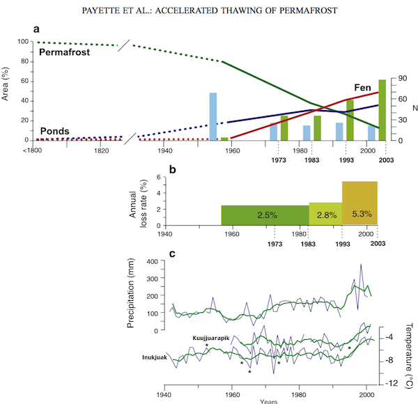 : Their findings are summarized as follows subarctic-peat-thawing.kmz (1.6 KB)
|
|
Full Member
Cartographer
May 2015 - Oct 21, 2024 18:35:52 GMT
“ Fellow Royal Canadian Geographical Society „
|
Post by jeanthie on Jun 29, 2015 2:09:09 GMT
Maps that are important in my past and future posts
This post provides as background a few maps that provide a good overview of the type of permafrost I am trying to monitor with Google Earth and other publicly available satellite and airborne remote sensing sources. The permafrost map of Canada below was produced during the time I was Director of the National Atlas of Canada By Dr. J.A. Heginbottom, M.A. Dubreuil and P.A. Harker (1995) Canada - Permafrost, in: National Atlas of Canada, 5th Edition, Natural Resources Canada, MCR 4177. This map is obviously important since it gives an overview of the density and intensity of permafrost.  Since most of the focus in these posts is on monitoring permafrost in wetlands, the National Atlas of Canada Wetlands Maps is also an important overview document  I use the map produced by Kettles and Tarnocai in 1999, "The Effect of climate change on carbon in Canadian Soils. (Available on line through Elsevier's www.sciencedirect.com- global and planetary change 53 (2006) 222-232) as a guide to my Google Earth explorations. 
|
|
Full Member
Cartographer
May 2015 - Oct 21, 2024 18:35:52 GMT
“ Fellow Royal Canadian Geographical Society „
|
Post by jeanthie on Jul 3, 2015 3:24:25 GMT
Small Peat Plateau with collapse scar.kmz (330.41 KB)MONITORING PERMAFROST WITH GOOGLE EARTH:So far in this thread sites 1 and 3 have been described. Both have shown significant melting in the last 50 years with an acceleration in melting in the last decade. Site 2 , close to Churchill, Manitoba will be the focus of this post.  MELTING OF PEATPLATEAUS AND PALSAS IN HIGH TO LOW SUBARCTIC REGION, HUDSON BAY LOWLANDS, SOUTH OF CHURCHILL, MANITOBA In the 1971-73 period we carried our field work in Northern Manitoba to provide baseline information for a Northern Biophysical Survey of Manitoba and to Evaluate Remote Sensing Techniques for Biophysical Land Classification (Thie, 1976). The teams included Charles Tarnocai, Bob Smith, Gordon Mills, Dr.Gerry Beke and Jean Thie during the various field seasons. The Canada Centre for Remote Sensing, carried out airborne multi-spectral and thermal scanning missions as part of the multi-disciplinary and multi-stakehoder Manitoba Remote Sensing Program. The area was flown during the summers of 1972 and 1973 with a Falcon Fan Jet at 10,000 meters above seal level (ASL) and selected areas at 1525 and 3050 M. ASL. Figure 1: Peat Plateau permafrost landform in 1972 A typical example of the type of permafrost landforms in wetlands is provided by the slide below taken from a beaver aircraft using a telephoto lens in 1972. Area A shows a collapse scar where permafrost has melted. The small black spruce trees are slowly being submersed in the waterlogged scar. The area around B is typical of the non-frozen wetland. Sparse growth of Tamarack (Larix Laricina) can be seen here in a poorly developed ribbed fen. drainage is from right to left. Around D is a typical growth of stunted Black Spruce (Picea Mariana) can be seen. Light coloured ground cover between the spruce is a combination of lichen and mosses. www.geostrategis.com/images7/CH332-600.jpg Figure 2: Same Peat Plateau on 2003 Google Earth Image The same peat plateau 31 years later area is show on a high resolution Google Earth image 'taken' at about 140 meters above ground level. Date of image 2003- Aug 27 There is a significant 31 year time difference between the two images but initially no significant differences in vegetation cover or permafrost are apparent. Although melting is an active process, the melting (degradation) rate is very slow. In areas like this building (aggradation) of permafrost may occur, but none is visible in these images. It is interesting to look at these two images combined on Google Earth:  Figure 3: This is the same peat plateau as on the GE image above, but taken in 2011-12, almost 10 years later. There are no significant differences in the melting areas  Figure 4: This winter images was taken around 2011. The snow cover enhances the trees and tree density. The densest areas are the stable edges of the frozen peat plateaus (blue arrow) . The unstable melting edges are devoid of trees, and the trees that were there are keeled over and sinking in the melting scar ( see green arrow) . It is clear from these images that melting occurs, but it is rather slow. In the left bottom corner there is a thin dark circle of trees which surrounded a permafrost island which has disappeared, indicating that melting has gone on for quite some time (red arrow).  Using this relative simple pattern recognition approach displayed on the above images, we can interpret/ extrapolate / map melting permafrost and relative stable permafrost in these wetland areas. Green arrows show a selection of the active melting areas, while the blue arrows show the far dominant stable edges. While melting can be observed (although very slow rates), the actual building of the permafrost appears to be virtually impossible to identify. I will spend some time on this in future posts.  . webb site: www.geostrategis.com/p-permafrost-churchill.htmSmall Peat Plateau with collapse scar.kmz (330.41 KB)
|
|
Full Member
Cartographer
May 2015 - Oct 21, 2024 18:35:52 GMT
“ Fellow Royal Canadian Geographical Society „
|
Post by jeanthie on Jul 9, 2015 2:30:03 GMT
Wild fires are a natural part of boreal and sub-arctic ecosystems. Most of the fires in remote areas are caused by lighting strikes. Satellites provide an effective way of monitoring fires, but also provide an impressive record of past fires and ways ecosystems have adapted. Also in my study area near Churchill, Manitoba (site 2) fire occur regularly in wetland permafrost areas. Figure 1 below shows a small scale overview. Fires 'scars' of fires in the last 10-15 years are most frequent in the western and southern part of the images. They are visible as reddish-pink areas. The red arrow point at one of the very recent burn areas. This post deals with a burn area (white arrow) in my study area.  The 'recent' fire is and visible on active on a Bing image for the area. Figure 2.  A detailed image of the burn: Figure 3  Before the burn, this peat plateau looked like: Figure 4. The light coloured area at the centre light coloured lichens.  Google Earth provides an historic image of the area before the burn and after. Before the burn: Figures 4 and 5  I have used the Apple Maps image (Figure 6) which was just taken after the fire to illustrate the present situation (also visible on the GE KML)  Typically, in the past, fires have not had much impact on the melting rates of permafrost in peat plateaus. This will be a good area to monitor if this is still the case. In 1971 and 1972, I was flying over this area with a helicopter to do field work (soil, vegetation and permafrost sampling) in preparation of the launch of the ERTS (Later called Landsat satellite) and testing of the various sensors for northern ecological surveys. This slide (figure 7) just touches the burn area (left edge of the slide image). The flight line is mapped on the Google Earth 'historic' image - figure 5.  Below is an overview of the fieldwork and airborne surveys I carried out as part of these studies.  |
|
Full Member
Cartographer
May 2015 - Oct 21, 2024 18:35:52 GMT
“ Fellow Royal Canadian Geographical Society „
|
Post by jeanthie on Mar 28, 2016 1:06:01 GMT
Continuing with Study Area 1: In the early seventies I published an article in the Arctic Journal on the "Distribution and Thawing of Permafrost in the Southern Part of the Discontinues Permafrost Zone in Manitoba" (Canada)The publication includes a number of figures and images which I will show in this post and which I will revisit 40-50 years later (depending on the date of the satellite images available through Google Earth or Apple Maps) It should be interesting to see how significant the changes have been and I will report in detail in future posts. Figure 1 provides a simple overview if the study area Figure 2 provides a visual legend of the vegetation types/ ecosystems you can see on aerial photos or satellite image Figure 2 provides a visual legend of the vegetation types/ ecosystems you can see on aerial photos or satellite images  Figure 3 provides examples of permafrost landforms which were studied and mapped for change between 1926, 1947 and 1967. The top two provide a stereopair of air photos taken 1n 1967. The graininess of the images is the result of the fact that the source of the images as shown here are taken our of the printed journal paper. The second two provide a change perspective between 1947 and 1967;
the third pair also represents a stereo pair of 1967 air photos Figure 4 provides example of the typical permafrost landforms and melting types in the study area Figure 4 provides example of the typical permafrost landforms and melting types in the study area
 This is Fig 4 based on images taken in 2014. This is Fig 4 based on images taken in 2014.
The images below are from a Apple Maps coverage of the study area around 2013-14. Google Earth does not provide adequate resolution to make accurate comparisons. Some quick differences: The small permafrost areas in Fig 4A have all but disappeared; In Fig 4B the permafrost in the small peat plateau (2) is now gone, all you see now is surface water and a ring of trees growing on non-frozen wetlands; In Fig 4C some small patches of permafrost are left; the most recent melting is represented by the yellowish colours; in Fig 4D virtually all permafrost is gone;  ![]() |
|
Full Member
Cartographer
May 2015 - Oct 21, 2024 18:35:52 GMT
“ Fellow Royal Canadian Geographical Society „
|
Post by jeanthie on Jan 14, 2017 2:30:19 GMT
Monitoring Melting of Permafrost with Google Earth
The Wekusko- Minago Site in Northern Manitoba
By chance I had some time looking at some old aerial oblique photos taken in 1925. It is always very exciting to have a look at an 'historic landscape' and compare it with the present as can be done so easily with Google Earth. As early as 1921, Canadian Royal Air Force pilots returning from WWI played an important role in exploring Canada from the air. Their legacy is stored in Canada's National Air Photo Library, now one of the most important environmental baseline data bases in Canada. This early and important contribution from the ' men in their flying canoes' forms a unique baseline from which environmental change can be measured as well as visually shown. Figure 1: It is rather interesting to think that this crew may actually have taken the 1925 oblique aerial photos which are such an important part of this analysis.  Figure 2 Figure 2: another view of the flying boat or also called "flying canoe" The Wekusko Map area (63J) in Manitoba, Canada is just North of Lake Winnipeg. It is an interesting area, ecologically and geomorphologically. A very large portion of the land areas is covered by wetlands predominantly fens and bogs. They were formed after the drainage of Glacial Lake Agassiz. The organic material typically formed over glacial lacustrine clays. The study site is just North East of the letter D. The area represented by D are predominantly wetlands with sporadic but clearly visible permafrost landforms. Lake Winnipeg is in the South East corner of this 1973 Landsat Image
Figure 3 1973 Landsat image

Permafrost in Peat plateaus and palsas is common in the wetlands in this area. It has been speculated that the maximum extent of the permafrost in wetlands was reached in this area during and just after the 'little ice age' (Thie 1973). Permafrost in peat plateaus and palsas can be forming (aggradation) or melting (degradation). Both processes can occur simultaneously on the same landform or in the same landscape. If aggradation exceeds degradation permafrost would be (slowly) expanding and consequently the black spruce forest cover expands. When degradation dominates, permafrost disappears. The melting scars are quite prominent and can be easily monitored with air borne and satellite images taken over a period of time. The examples below cover a rather unique 85 year timeline. Figure 4: 1925 oblique aerial photo of a long peat plateau near Waskik Lake and the Minago River in Northern Manitoba The numbers 1, 2, 3, 4 all indicate permafrost areas in peatlands. The large peat plateau (2, 3) is about 3400 meters in length. Although small collapse/ melted areas can be seen in the centre of the plateau, the edges of the peat plateau are still intact- no significant melting visible. The area around 4 was burned perhaps about a decade before (around 1915): significant melting had already occurred here (i.e. before 1925 and probably before 2015) but the centre core still has permafrost and has regenerated in black spruce with some white birch. Figure 5 1984 Google Earth image - source SPOT Image
 The 2010 Google Earth image shows approximately the same area. Significant melting has occurred over the 85 year period. Some of the melting areas are identified by blue arrows. Melting and collapse of the edges of the peat plateaus is most common. The light green arrows show mature stands of Black Spruce. These areas have not been burned in this period. The area just surrounding (3) was burned in the early 1970's, but permafrost is still present, although the 'tail' area -blue arrow- point to a large melted part. The gradient of the wetland is in the order of 1 meter per kilometer, drainage flow indicated by the grey dotted arrow. Typical active melting edges show a loss of 20-35 meters of permafrost over a 60 year period which averages out to between just over 0.3m to 0.6 meters per year.More information is available at: www.geostrategis.com/p_permafrost-wekusko2.htmIn conclusion we can say for this area that permafrost melting has continued since the earliest air photo record of 1925. These old oblique photos also show that dominant melting of permafrost started much earlier than 1925. No building or expansion of permafrost has been observed. Wildland fires have not visibly influenced melting rates of permafrost.
85 years of permafrost melting- Wekusko area.kmz (105.88 KB)
|
|
Cartographer
April 2015 - Nov 3, 2024 2:30:25 GMT
|
Post by washi on Jan 15, 2017 16:39:37 GMT
 Jean, The image in your Photo Overlay isn't showing for me. Is it possible that it would be if the image were stored online? |
|
Full Member
Cartographer
May 2015 - Oct 21, 2024 18:35:52 GMT
“ Fellow Royal Canadian Geographical Society „
|
Post by jeanthie on Jan 15, 2017 19:32:26 GMT
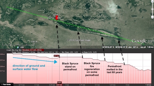
Thanks Washi. Yes the image is stored on-line on my website. It should work now, and I will make some additional improvements in the near future. One of the things I am adding and studying are the most recent Apple Maps image for the area. They are snow covered and the snow provides a 'natural enhancement' to study tree density and as result give a more precise location of permafrost.  The image below shows longitudinal elevation profile of the wetland and peat plateau: The length of this profile is 7.18 km, with an elevation loss of 3.03 m. It is interesting to see that the peat plateau with the mature Black Spruce appears level and is distinctly higher than the surrounding areas. Of course, the Digital Elevation Model and data base used by Google Earth is not really accurate enough to use for analytical purposes.  The 1931 oblique photo below, taken by a "flying canoe" shows clearly the tail of the peat plateau in 'good health' except for the center portion. The small dark palsas have mostly disappeared by now. These 1920-30 aerial photos provided a source of reference to recreate the past around 1800-1850 when permafrost was at its probable maximum extent. ![]() ![]()  Recreating the Past Situation Using Todays Satellite Images: 1800-1850 Recreating the Past Situation Using Todays Satellite Images: 1800-1850
Figure below: Maximum extent of permafrost: probable permafrost situation around 1850. This back casting scenario is based on the analysis of present permafrost and old melting scars. Time period of maximum extent is based on the 'Little ice Age' influence in this area. The past permafrost is mapped on the most recent, high resolution Apple Maps winter image: the large satellite image above.  more information on www.geostrategis.com/p_permafrost-wekusko2.htm |
|


 The melting


 :
:


