Junior Member
April 2023 - Apr 24, 2024 17:38:18 GMT
“ school chromebook researchin' „
|
Post by thazz on Sept 27, 2023 20:53:01 GMT
This is a less formal post compared to all my others but I wanted to see what others thought of the new changes Google dropped on our beloved website. I don't know if the changes have rolled out for the app and/or pro, but the browser version (the one I use for the sake of my poor school-provided Chromebook) has a whole new layout that looks like this (ignore my blurring on my pfp at the top right): 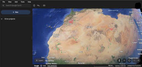 Personally, I hate this change. I mean, whose idea was it to add another bar? The first one is intrusive enough already. I feel like my screen is squished down and it's just very awkward to zoom in/out now. Either way, I want to hear your guys' opinions and start a discussion since y'all are the professionals. Also, if you know any way I can revert the version, please let me know  P.S. I'm pretty sure cloudinary will squish my image so if you can't tell the new changes just open Google Earth up on your browser, it should be there I think. Either way you can see the new/changed features better that way. Thanks, |
|
Junior Member
July 2022 - Mar 5, 2024 1:01:24 GMT
|
Post by fried_oreos on Sept 28, 2023 21:20:55 GMT
I haven't used the web version that much, so I can't comment on the new layout. But what I can say is that this change probably won't come to the desktop app. Google Earth app and web are very different. Google Earth web seems to be developed with Google Maps, while the Desktop has a totally separate team working on it.
|
|
Wizard
March 2015 - Apr 23, 2024 16:21:04 GMT
|
Post by tek on Oct 4, 2023 21:09:00 GMT
I never use it either. The desktop version is much faster and consumes fewer resources.
Perhaps, you are not alone and better be the first to start a thread in the Help Forum pointing to the wish for an option to hide the bar and an ability to unhide it when, say, pressing the alt button.
|
|


