Newbie
October 2024 - Oct 23, 2024 17:07:27 GMT
|
Post by Alan Plisskin on Oct 18, 2024 16:57:07 GMT
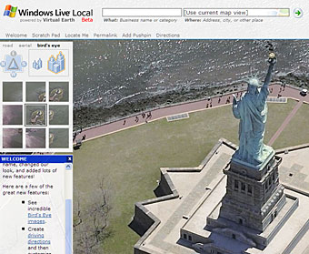
I'm really appreciative of Google's choice (or neglect) to change Google Earth Pro's UI to the same ugly smartphone-like interface as the rest of their tools. Everything was just better and easier to use back when people knew how to develop UI. Here's an example of the UI from Google Earth Pro (internet screenshot from Windows as to include the menubar, because I use a Mac)  Simplistic, small and easily identifiable icons, no unneeded padding, gives you the most frequently used options on one screen, makes full use of tree menus and other useful elements. Makes great use of gradients to improve the UI. Compared with Google Earth's web interface:  Needlessly large amounts of padding, giant icons that have no real reason to have compared to the Pro version's smaller ones, a lot of options hidden behind extra clicks and menus, discards a lot of useful UI elements for "simpler" menus. I understand some of this is because one is the professional version and one is the web one, but that doesn't mean the web interface has to look... subpar. {The same comparison for Bing Maps (A more drastic example)}Here's an example of the UI from Windows Live Local:  Although not exactly the same kind of tool as Bing Maps, it still has a great interface. It's simple, no oversized icons, and it works. Aesthetically pleasing and well themed with subtle background images and graphics. Compared with the modern interface of Bing Maps:  Lots and lots of padding, unneeded icons, slow interface. Blank white abyss background with no gradients. |
|
